New Guide: Best Smart Home Devices Under $100 — automate your home without the crazy price tagRead the Guide →
Color Psychology at Home
Discover how different colors affect mood, energy, and well-being. Learn to create the perfect ambiance in each room using the science of color psychology.
The Power of Color
Color is one of the most powerful tools in interior design. It has the ability to influence our emotions, affect our energy levels, and even impact our physical well-being. Understanding color psychology can help you create spaces that not only look beautiful but also feel exactly the way you want them to.
Whether you want a calming bedroom retreat, an energizing home office, or a warm and inviting living room, choosing the right colors is essential. In this guide, we'll explore how different colors affect our mood and provide practical tips for using them effectively in your home.
Emotional Impact
Colors trigger emotional responses and memories
Energy Levels
Certain colors can energize or calm your space
Perceived Space
Colors can make rooms feel larger or cozier
Complete Color Guide
Explore each color's psychological effects and learn how to use them effectively in your home
Red
Passion • Energy • Warmth
Psychological Effects
Red is the most stimulating color, known to increase heart rate and create a sense of urgency. It evokes passion, excitement, and warmth, making it perfect for spaces where you want to encourage conversation and activity.
Best Used In:
- Dining Rooms: Stimulates appetite and conversation
- Accent Walls: Adds drama without overwhelming
- Entryways: Creates a bold first impression
Pro Tip: Use red sparingly in bedrooms as it can be too stimulating for sleep
Blue
Calm • Trust • Serenity
Psychological Effects
Blue is universally calming and promotes feelings of tranquility and trust. It can lower blood pressure and heart rate, making it ideal for spaces dedicated to rest and relaxation. Lighter blues feel airy and spacious, while deeper blues add sophistication.
Best Used In:
- Bedrooms: Promotes restful sleep and relaxation
- Bathrooms: Creates a spa-like atmosphere
- Home Offices: Enhances focus and productivity
Pro Tip: Pair blue with warm wood tones to prevent it from feeling too cold
Yellow
Joy • Optimism • Energy
Psychological Effects
Yellow is the color of sunshine and happiness. It stimulates mental activity, generates muscle energy, and creates feelings of cheerfulness. However, too much bright yellow can be overwhelming and may even cause anxiety.
Best Used In:
- Kitchens: Creates a cheerful cooking environment
- Home Offices: Boosts creativity and concentration
- Hallways: Brightens dark transitional spaces
Pro Tip: Use softer, buttery yellows instead of bright lemon for a more sophisticated look
Green
Balance • Growth • Harmony
Psychological Effects
Green is the most restful color for the human eye. It represents nature, growth, and renewal, creating a sense of balance and harmony. Green can reduce stress and promote feelings of tranquility and health.
Best Used In:
- Living Rooms: Creates a welcoming, balanced atmosphere
- Bedrooms: Promotes relaxation and restful sleep
- Bathrooms: Evokes spa-like serenity
Pro Tip: Sage and olive greens are trending and work beautifully with natural materials
Orange
Enthusiasm • Creativity • Warmth
Psychological Effects
Orange combines the energy of red with the happiness of yellow. It's associated with enthusiasm, creativity, and warmth. Orange can stimulate conversation and appetite, making it perfect for social spaces.
Best Used In:
- Living Rooms: Encourages social interaction
- Creative Spaces: Boosts inspiration and energy
- Accent Pieces: Adds warmth without overwhelming
Pro Tip: Terracotta and burnt orange are sophisticated alternatives to bright orange
Neutral Colors
White & Cream
Purity, cleanliness, and spaciousness. Creates an airy feel and serves as a perfect backdrop for any style.
Gray
Sophistication and neutrality. Provides a modern, timeless foundation that works with any color palette.
Beige & Taupe
Warmth and comfort. Creates a cozy, inviting atmosphere while remaining versatile and elegant.
Room-by-Room Color Tips
Apply color psychology principles to create the perfect mood in every space
Bedroom
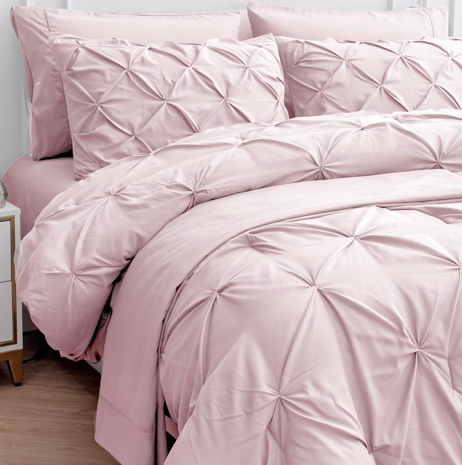
Choose calming colors like soft blues, gentle greens, or warm neutrals. Avoid bright, stimulating colors that can interfere with sleep.
- Soft blue, lavender, sage green, warm gray
Living Room
Use warm, inviting colors that encourage conversation and relaxation. Layer different shades for depth and interest.
- Warm beige, terracotta, olive green, soft coral
Kitchen
Opt for energizing yet clean colors. Yellow stimulates appetite, while white creates a fresh, hygienic feel.
- Soft yellow, crisp white, sage green, light gray
Home Office
Choose colors that enhance focus and productivity. Blue promotes concentration, while green reduces eye strain.
- Navy blue, forest green, warm gray, soft yellow
Creating Perfect Color Combinations
The 60-30-10 Rule
This classic interior design rule helps create balanced, harmonious spaces:
Dominant Color
Usually walls and large furniture pieces
Secondary Color
Upholstery, curtains, and rugs
Accent Color
Decorative accessories and artwork
Complementary Colors
Colors opposite each other on the color wheel create vibrant, high-contrast combinations:
Red + Green
Blue + Orange
Yellow + Purple
Teal + Pink
Monochromatic Schemes
Using different shades and tints of a single color creates sophisticated, cohesive spaces:
Example: Blue monochromatic palette from light to dark
Common Color Mistakes to Avoid
Ignoring Lighting
Colors look different in natural vs. artificial light. Always test paint samples in your space at different times of day before committing.
Too Many Colors
Using too many colors creates visual chaos. Stick to 3-4 main colors throughout your home for cohesion.
Forgetting Undertones
Every color has undertones (warm or cool). Mixing undertones can make a space feel disjointed. Keep them consistent.
Matching Everything
Perfectly matched colors can look flat. Use varying shades and textures to add depth and visual interest.
Add Color to Your Space
Curated products to help you implement color psychology in your home


Ready to Transform Your Space?
Start applying color psychology principles today and create a home that looks beautiful and feels amazing